The Ask: Improve awareness of past due status for customers on an ecommerce site
Why It’s Important: A good error message both explains the blocker and helps the user get past it (source)
The Process: The business group making this request asked for a pop-up modal that would show up right when a past due customer logs in. The modal window would block any other actions on the page until the customer dismissed it.
I had some concerns about this approach, and I expressed them to our interaction designer:
I’ll take in good faith the idea that customers logging in will see this modal and that it will focus their attention. Indeed, I think that’s the business goal in having a modal: that it doesn’t allow the customer to interact with any other page elements until the modal is interacted with or dismissed.
But if the modal does focus attention, could it perhaps also focus emotion? If I think through the emotional spectrum that this type of message inspires, I’m assuming that it’s generally negative: surprise, dismay, frustration, and perhaps even shame.
I challenged myself over the weekend to try to think through why an on-the-page message feels like it would be gentler. After all, our on-the-page message pattern doesn’t have a dismiss option, so it might be in front a customer even longer than a modal would.
I think that part of this, for me, is structural. Having an on-the-page message that still lets the customer interact with the rest of the site normally somehow seems to say, “You do owe us money, but we know that there’s more to you than that.”
With a modal, we are structurally saying something more like, “We don’t care why you came here. We don’t care what you thought you were doing or trying to do. We only care that you owe us money.”
And the modal format itself has been so abused that it’s become a hated advertising technique. I am concerned that trying to communicate a frustrating message in a format that is, itself, frustrating makes a difficult situation even harder.
He agreed, and we moved forward with an on-the-page messaging approach.
The first touchpoint would be when a customer logged in and would appear at the top of the home page.

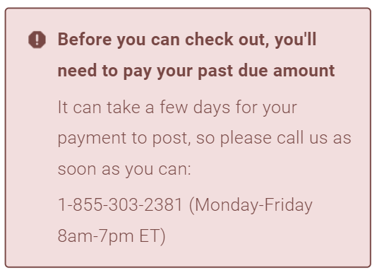
The second touchpoint would appear on the cart page just before checkout. Because past due customers are blocked from buying, this message escalates to a stronger tone and the red “blocker” design.